Salesforce.com Mission Bay Global Headquarters
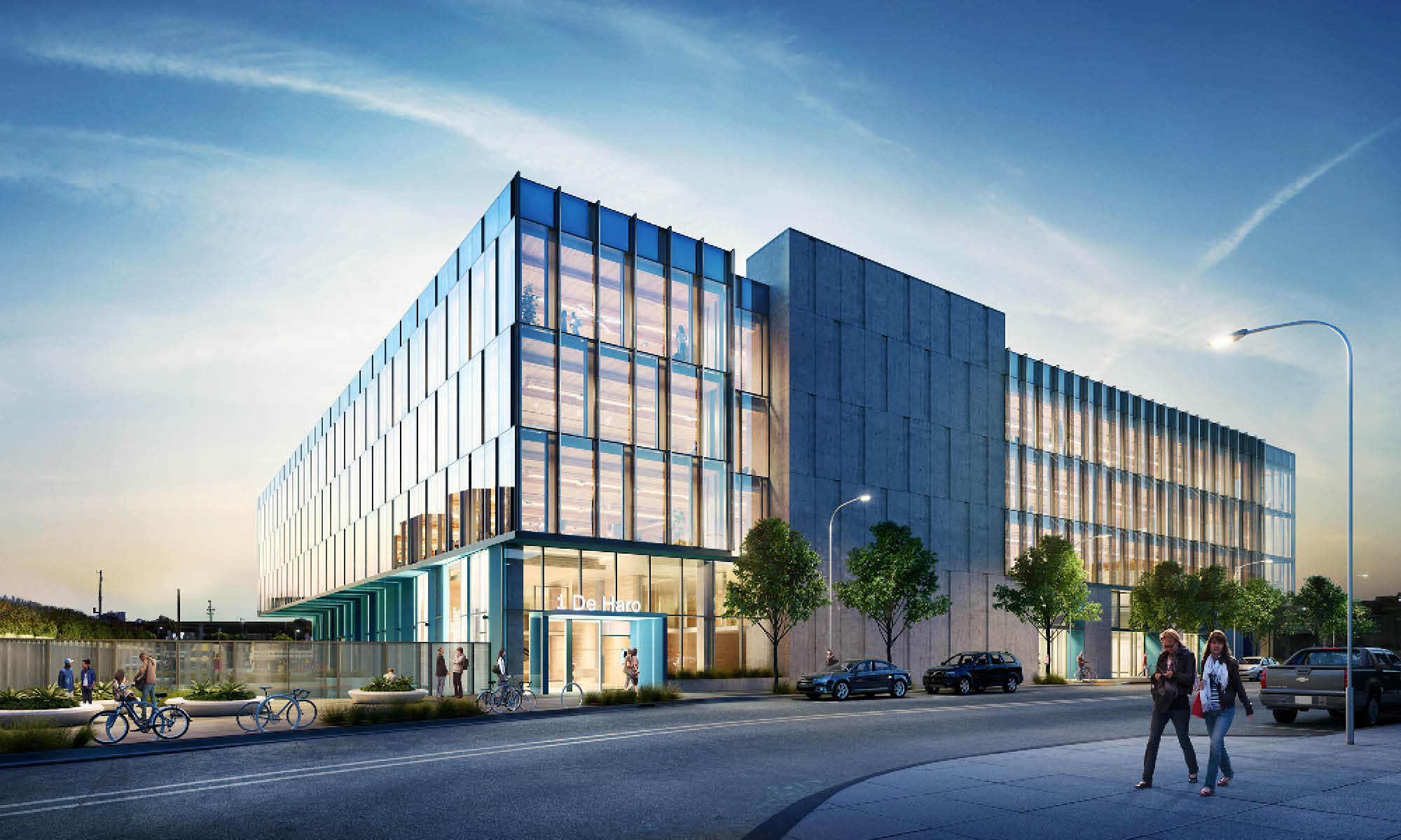
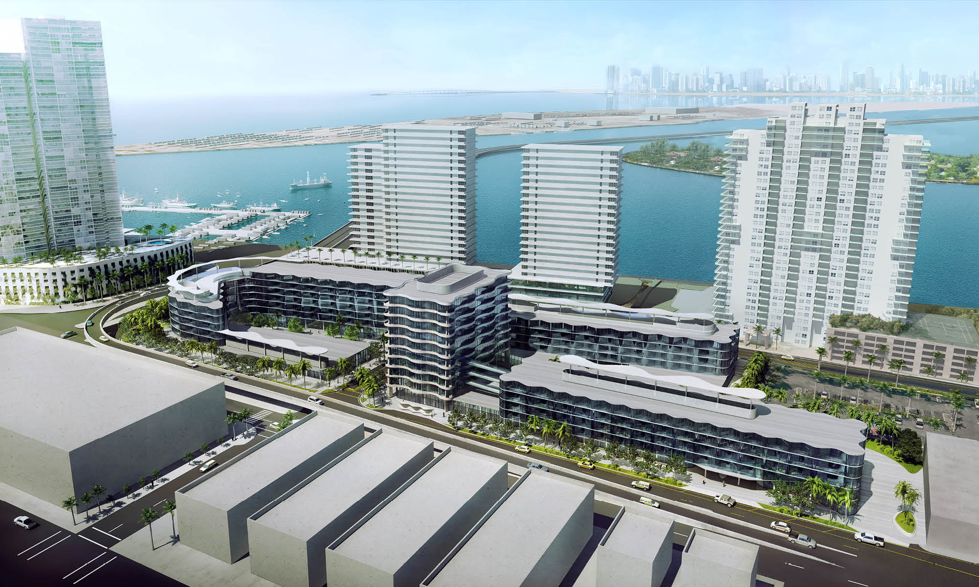
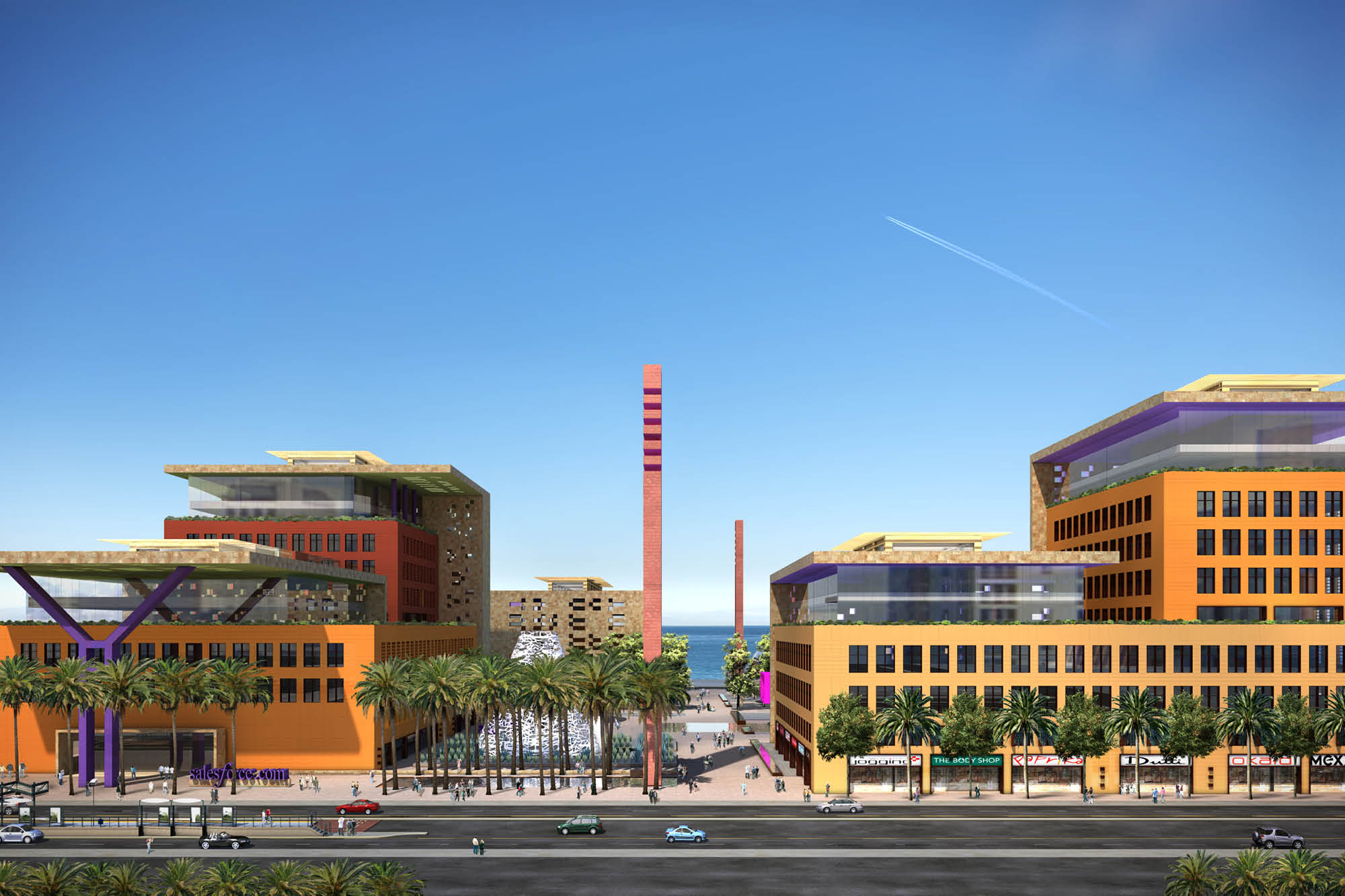
With a goal of net zero, the design for the salesforce.com global headquarters is innovative in every aspect. Together with a world-class team of consultants, ACLA developed a vibrant vision for this 14 acre, 8-block addition to San Francisco.
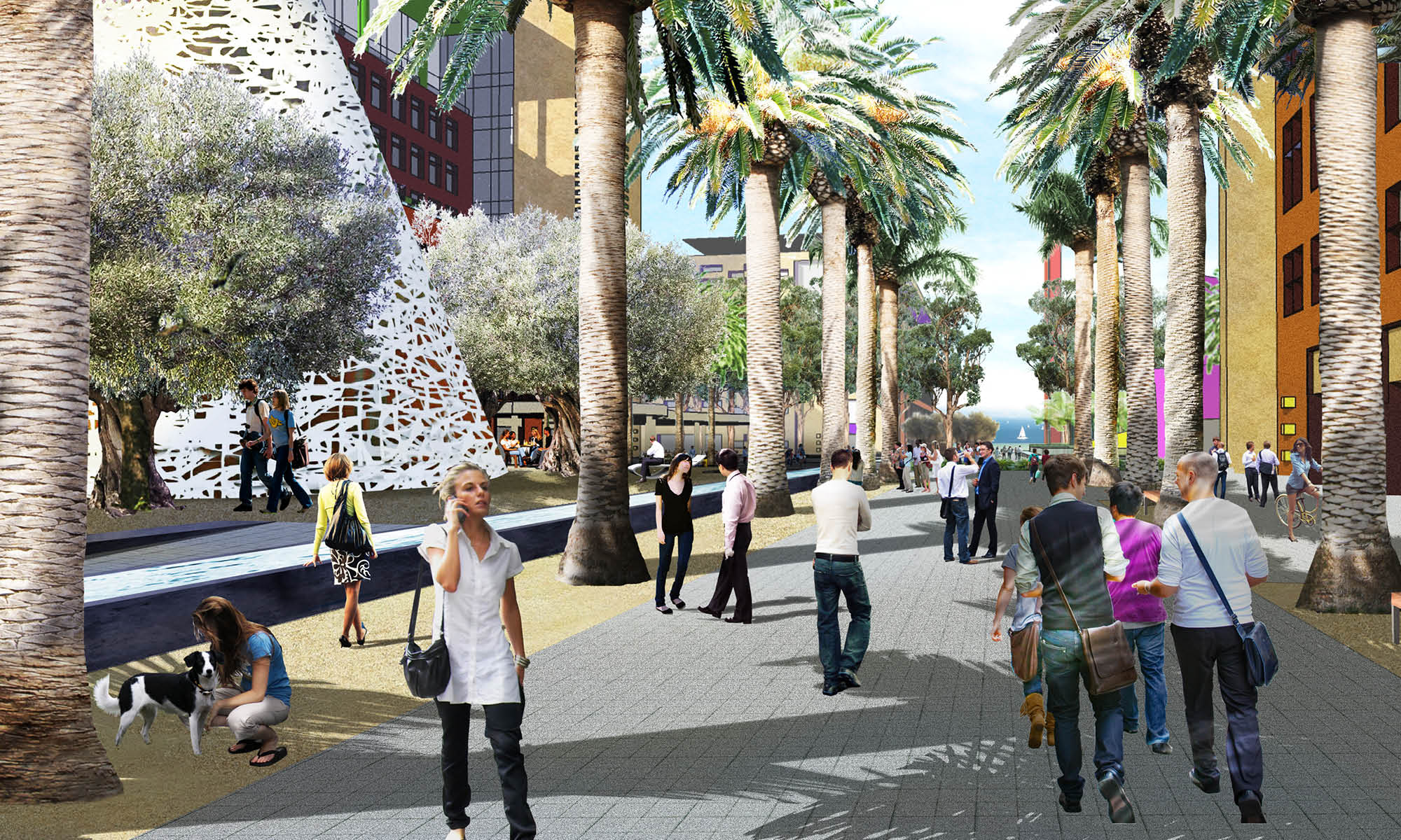
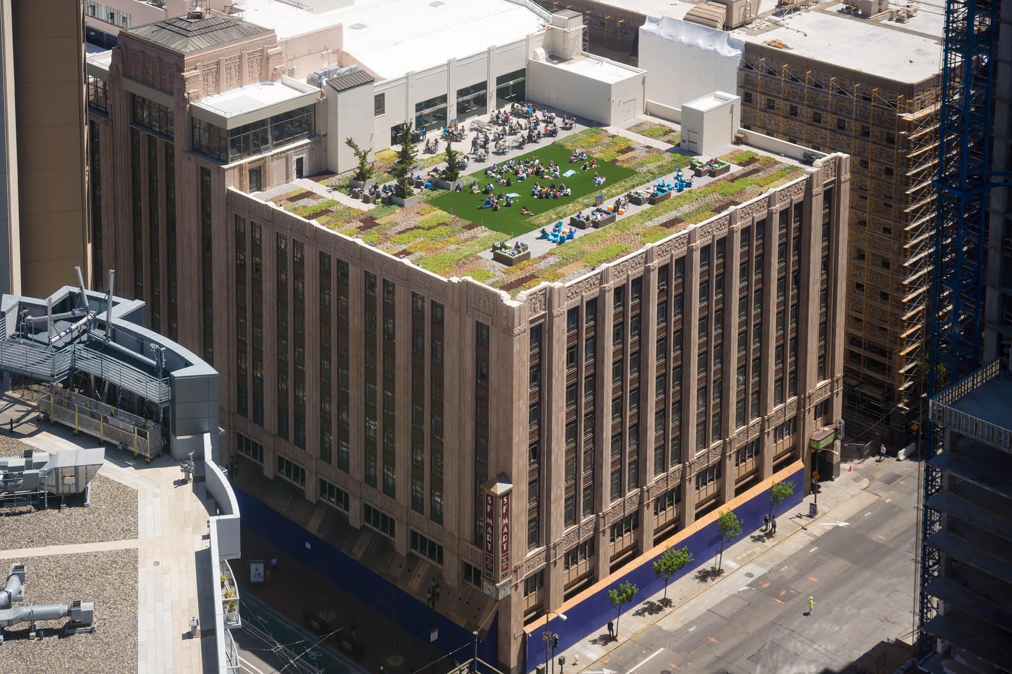
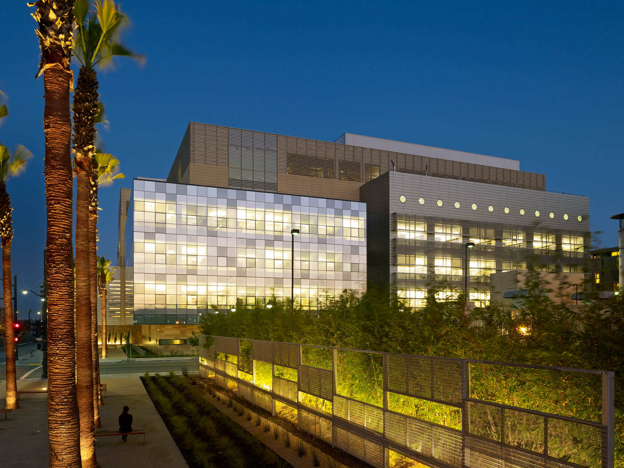
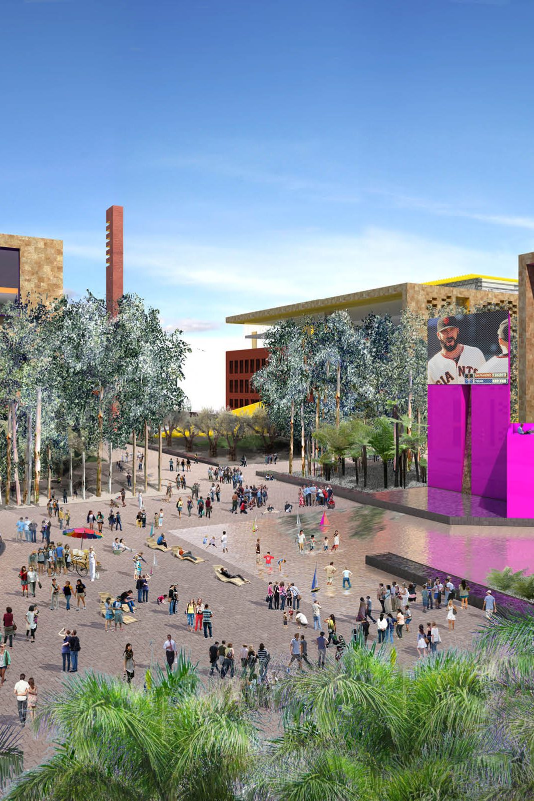
The landscape design, with a budget of 40 million, complements the project’s urban design approach by creating a network of courtyards and piazzas. Open space ‘varas’ are the neighborhood streets of the headquarters, anchoring the courtyards and providing access through the site, while framing views of the bay and the city beyond. The campus edges are porous, anchored with retail, and connect with the larger urban context. Expansive roof terraces further connect the buildings to their environment and add to the public space. At the center of the site, the Town Square is the site’s core public space with a pergola, programmable water feature, and space for hosting public markets and other events.
The team worked extensively with the city’s Redevelopment Agency, community groups and Planning Commission to create a vision of the campus that would be a lively and welcome addition to the city.
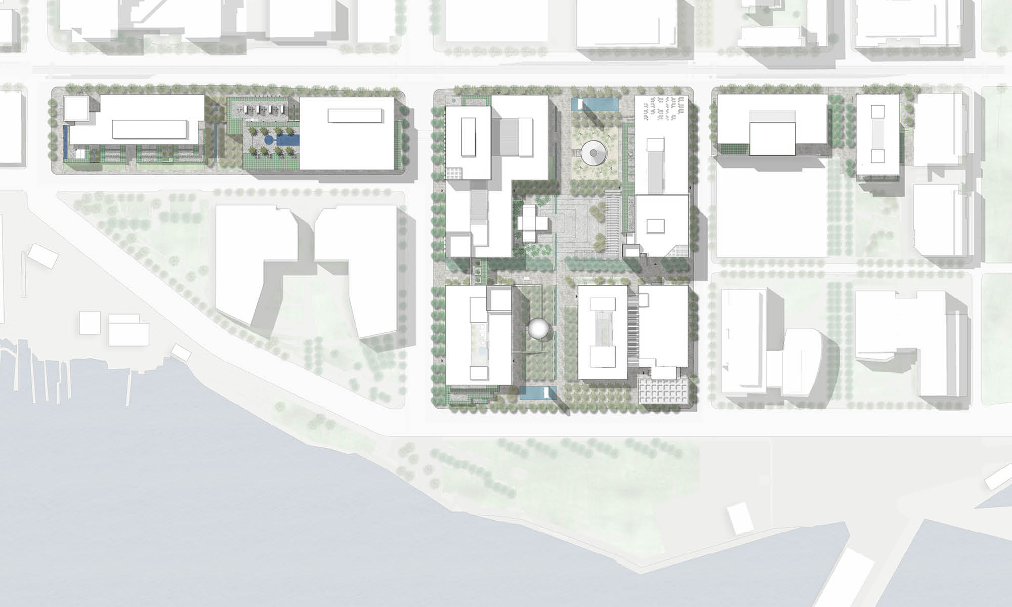
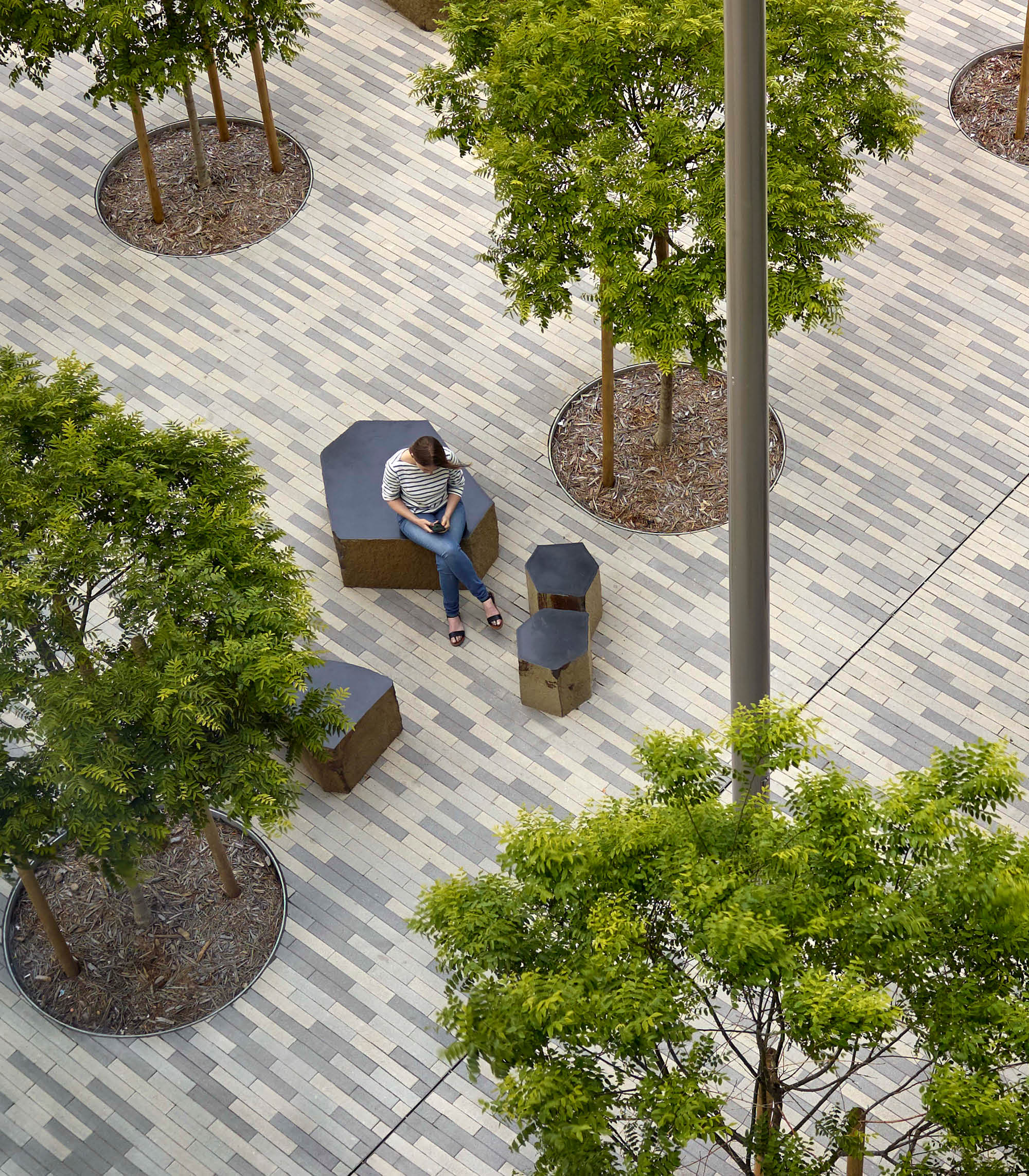
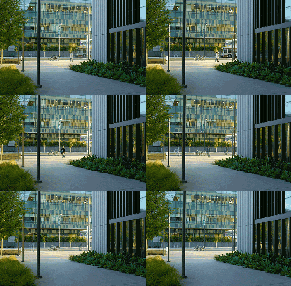
As a counterpoint to the lushly planted neighborhood parks that surround the site, the headquarters will offer a distinctly urban experience, with a variety of pedestrian amenities and climate-appropriate planting. Clearly defined courtyards and plazas invite public use and gatherings of a variety of scales. The campus edges are porous, anchored with retail, and connect with the larger urban context.
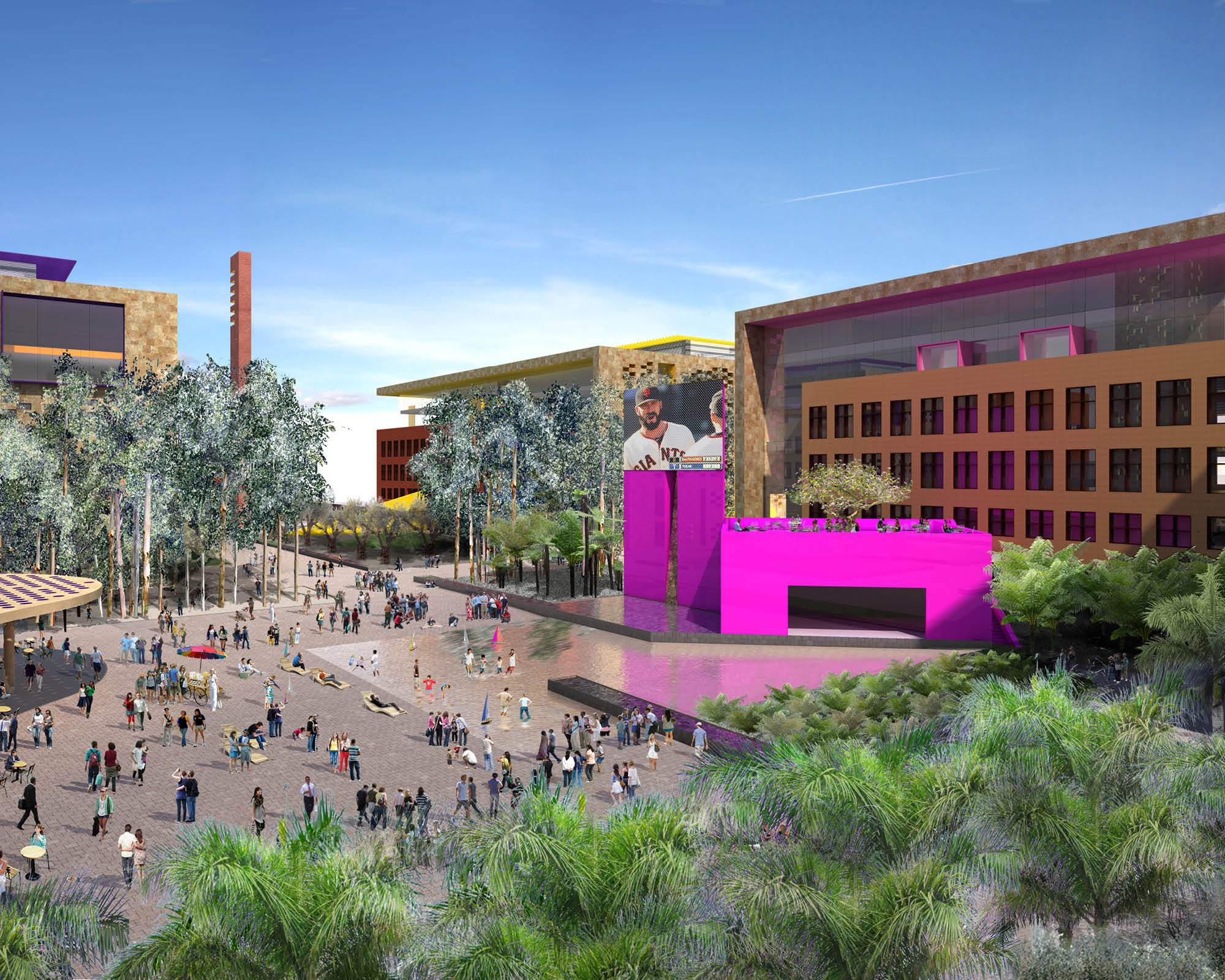
At the center of the site, the Town Square is the site’s core public space with a pergola, programmable water feature, and space for hosting public markets and other events.
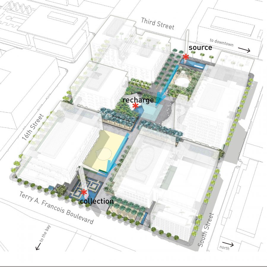
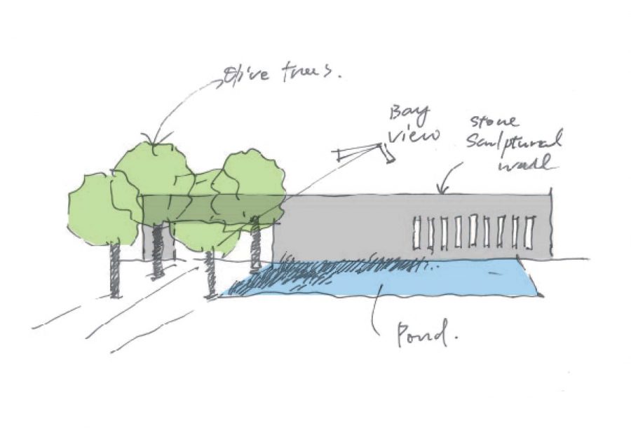
A directional spatial sequence clearly leads the public from the Third Street Muni stop through to the public waterfront park on the bay and reinforces the East-West vara. A thin plane of water, a ‘bio-acequia’, marks the east-west progression, and pools at the base of the pylons at both ends announce the terminus. A view corridor defines the north-south axis and connects the site to Mission Bay. The series of courtyards allow for an element of discovery and surprise as visitors wind their way through the site. Groves of trees offer spatial definition to the plazas, mitigate the wind, and humanize the scale of the large buildings.
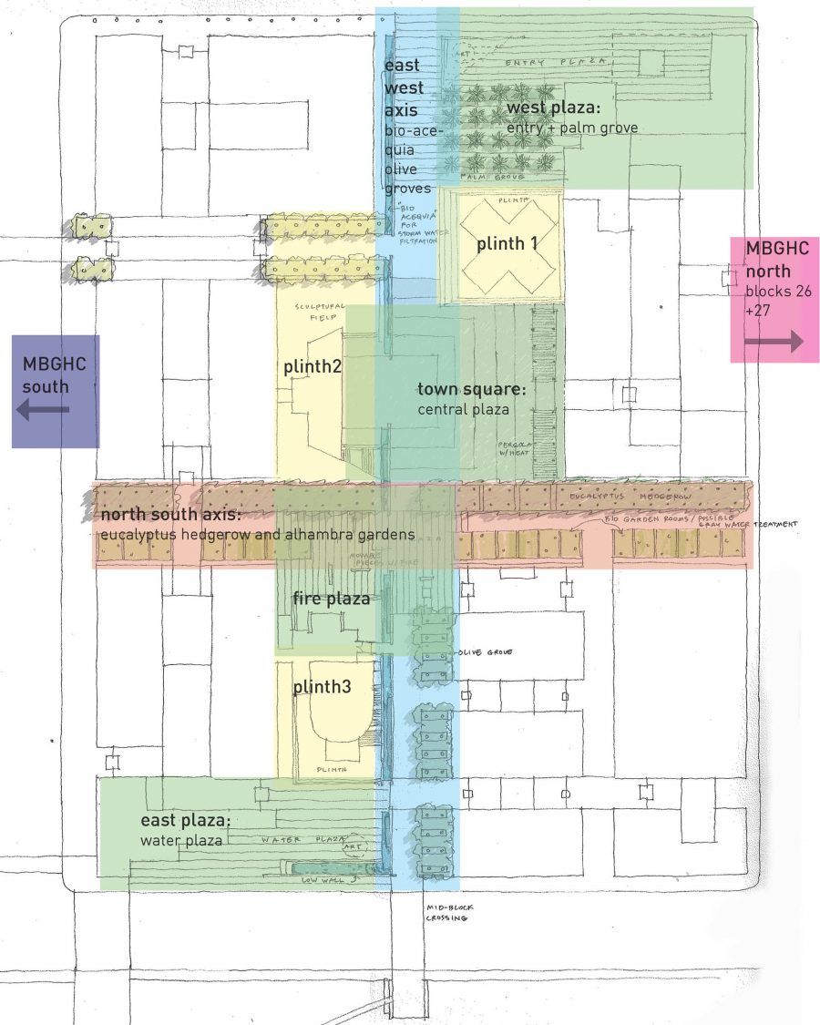
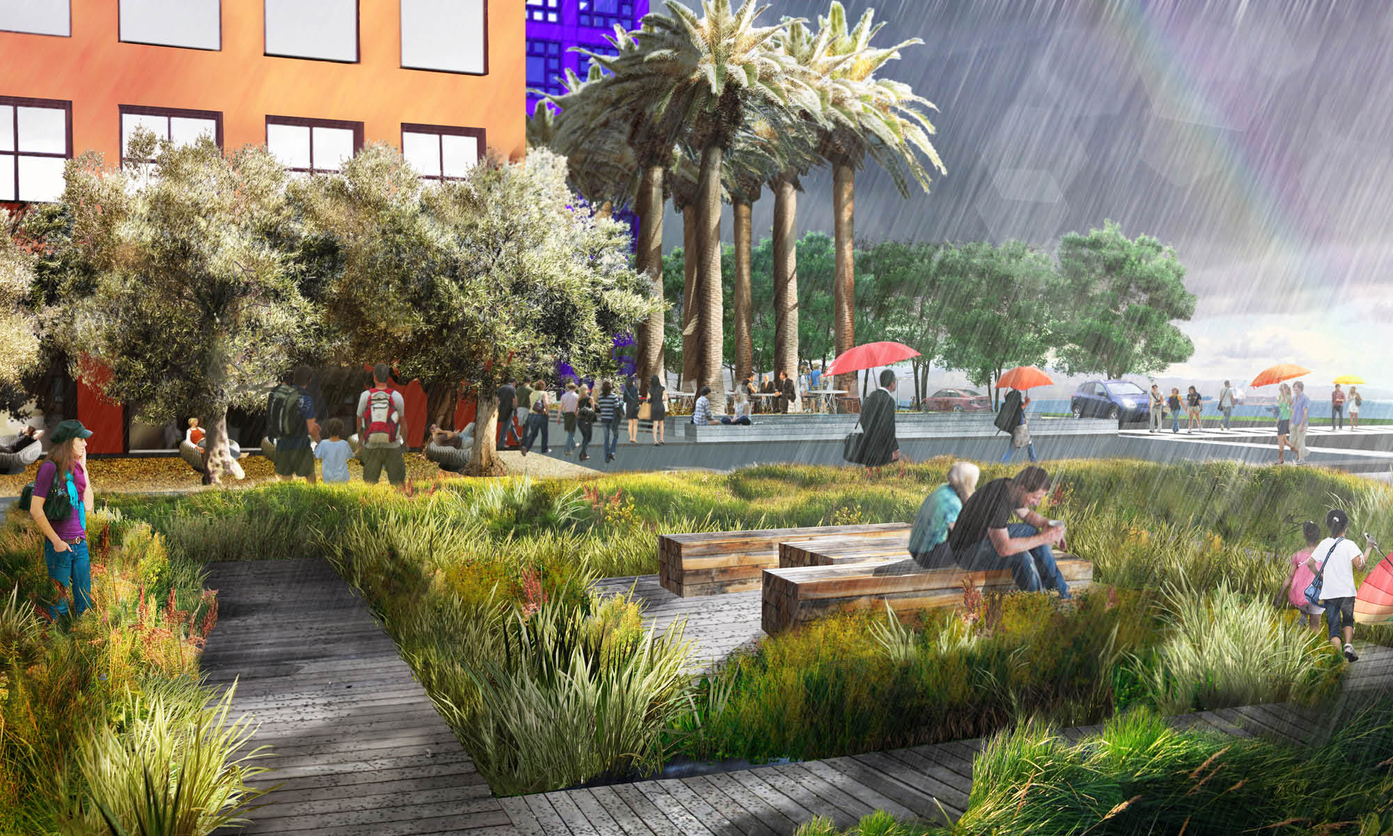
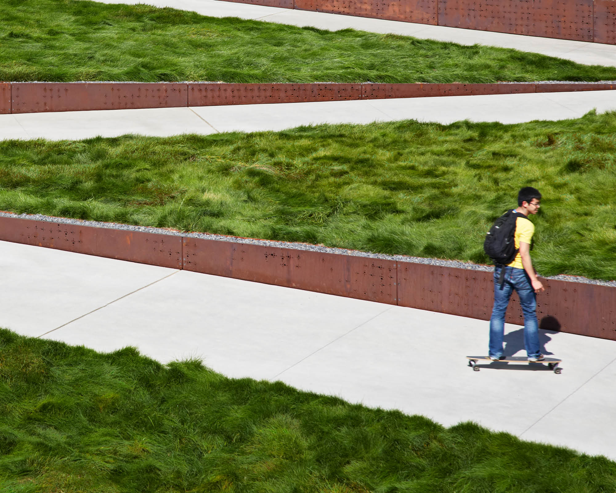
The site design supports the project’s environmental goals by reducing water consumption with a low water use planting approach. Foundation planting and water-thirsty groundcovers are avoided. Instead, the focus is on creating space with trees and opening up the ground plane with soft, aggregate mulches. The planting palette consists of climate-appropriate, Mediterranean species with a strong form to complement the architecture. Graywater, harvested from the building, is filtered and used for site irrigation. Stormwater not stored for re-use, will be cleaned through a series of biofiltration zones throughout the project. This project will be a pioneer in using recycled water on such a large scale and will work closely with the SFPUC to determine the guidelines appropriate for the site.
